21 Dec
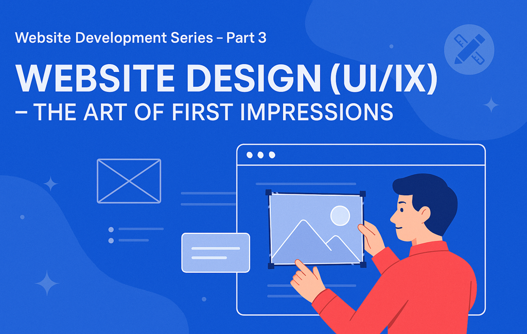
Introduction — Your Design Speaks Before You Do
Users form an opinion about your site in 50 milliseconds. Before content or features, design communicates trust, clarity, and credibility. Great UI/UX turns a visit into a decision: stay, explore, act.
This guide gives you a practical design playbook—from research and wireframes to visual systems, accessibility, performance, and measurement—so your site looks premium and converts.
🔗 Suggested internal links:
Part 1 – The Power of a Website
Part 2 – Planning Your Website – Blueprint for Digital Success
UI vs UX — Quick Definitions
- UX (User Experience): How it works—flows, IA (information architecture), accessibility, performance, emotion.
- UI (User Interface): How it looks—color, typography, spacing, components, imagery, micro-interactions.
They’re inseparable: UX sets the path, UI guides the steps.
UX Foundations — Make It Effortless
1) Information Architecture (IA)
Structure content the way users think.
- Group pages into 5–7 top-level items.
- Use descriptive labels (e.g., “Pricing,” “Services,” “Portfolio”).
- Maintain breadcrumb trails for depth.
- Add site search if you have lots of content.
Sri Lanka tip: Feature WhatsApp Contact in the primary or sticky header—high local adoption.
2) Navigation Patterns That Work
- Top bar + drop-downs for desktop.
- Hamburger + bottom sticky CTA on mobile.
- Keep the logo → Home link universal.
- “Contact” and primary CTA (e.g., Get a Quote) should be visible at all times.
3) Page Flow (F-pattern / Z-pattern)
Place your value proposition and CTA above the fold. Support with proof (logos, testimonials) before deeper detail.
Visual Design System — Consistent & Premium
Color
- Pick a primary (e.g., Grow Digitally purple→blue gradient), an accent, and two neutrals.
- Use color intentionally for hierarchy (buttons, links, alerts).
- Ensure contrast ratio ≥ 4.5:1 for body text.
Typography
- Choose 2 font families max (e.g., Poppins/Montserrat).
- Establish a scale (e.g., 32/24/20/18/16/14).
- Keep paragraph width ~60–75 characters for readability.
- Line-height: 1.5–1.7 for body text.
Layout & Spacing
- Use an 8-pt grid.
- Maintain consistent vertical rhythm (e.g., 24–40px between sections).
- Leverage cards and dividers to group content.
Imagery & Iconography
- Prefer authentic Sri Lankan context (teams, offices, local scenes) over generic stock.
- Use a consistent icon set (rounded vs sharp).
Accessibility — Design for Everyone
- Semantic HTML and proper heading order (H1 → H2 → H3).
- Meaningful link text (“View Services”, not “Click here”).
- Keyboard navigability and visible focus states.
- Alt text for all images; avoid text baked into images.
- Don’t rely solely on color to convey state (add icons/labels).
Accessibility boosts SEO, legal compliance, and conversions.
Responsive & Mobile-First
- Mobile traffic dominates in Sri Lanka; design mobile-first.
- Use fluid grids and srcset images.
- Keep tap targets ≥ 44×44px.
- Prioritize the primary CTA and contact entry points on small screens.
- Avoid hover-only interactions—provide touch equivalents.
Performance-Driven Design
Design choices affect speed (and SEO).
- Optimize hero images (AVIF/WebP, lazy-load below the fold).
- Limit heavy scripts; avoid auto-playing video above the fold.
- Prefer system fonts or a single variable font; preload key font files.
- Use SVG for icons/illustrations.
Aim for LCP < 2.5s, CLS < 0.1, INP < 200ms.
UX Research (Lean & Practical)
Even small studies uncover big wins.
- Heuristic review (Nielsen’s 10 heuristics).
- 5-user moderated tests on prototypes.
- Card sorting for menu labels.
- Tree testing to validate navigation.
- Competitor teardown (strengths/gaps).
Tools: Figma prototypes, Microsoft Clarity/Hotjar (post-launch), Google Forms for feedback.
From Wireframes to High-Fidelity
- Low-fi wireframes: content blocks, flow, no color.
- Mid-fi: spacing, components, starting copy.
- Hi-fi UI: final color, typography, imagery, micro-interactions.
- Interactive prototype: test critical paths (e.g., “Get a Quote,” checkout).
- Design review: with stakeholders and one outside observer.
Deliverables:
- Page list + user flows
- Component library (buttons, forms, cards, nav, modals)
- Grid/spacing rules & theming
- Accessibility notes
- Interaction specs
Components That Convert
- Hero with crisp value prop + 1 CTA (primary) + 1 secondary (optional).
- Feature rows (icon + heading + benefit text).
- Social proof: star ratings, client logos, testimonials with names/photos.
- Pricing: 3-tier card with highlights and FAQ below.
- Lead capture: short form (name, email/phone, message) + WhatsApp quick action.
- Footer: Sitemap links, contact, social media, and legal information.
Micro-Interactions (Use Sparingly)
- Button press states
- Subtle hover on cards
- Smooth scroll to anchors
- Toasts/snackbars for form submissions
- Skeleton loaders for async content
Keep durations between 150–250ms; favor easing over linear motion.
Forms that People Finish
- Ask only what you need (3–5 fields).
- Clear labels + inline validation.
- Use input masks for phone numbers.
- Show progress for multi-step forms.
- Offer WhatsApp/Phone alternatives.
Bilingual / Localisation (EN + සිංහල)
- Reserve space for longer Sinhala strings.
- Use fonts that support Sinhala glyphs.
- Keep date/phone/address formats local.
- Provide a language switcher in the header; persist preference.
Design System & Tokens
Create a lightweight system to move fast and stay consistent.
- Color tokens:
--primary-600,--neutral-800 - Type tokens:
--font-body,--font-head - Spacing tokens:
--space-8(8, 16, 24…) - Elevation tokens:
--shadow-sm/md/lg
Document in Figma; mirror in code (Tailwind config / CSS variables).
Designer → Developer Handoff (Figma to Code)
- Name layers/components; use auto-layout.
- Provide redlines (spacing, font size, line-height).
- Export assets (SVG icons, compressed images).
- Attach notes for accessibility and interactions.
- Share a UI kit page (buttons, inputs, states).
- Include responsive breakpoints (e.g., 360 / 768 / 1024 / 1280).
Tech pairing examples:
- React + Tailwind for speed and consistency.
- WordPress (Gutenberg): supply reusable block styles.
Quality Assurance (Design QA)
- Visual parity vs Figma (spacing, font sizes, colors).
- Hover/focus/disabled states for all controls.
- Form validation paths (success/error).
- Mobile cross-browser: Chrome, Safari iOS, Firefox.
- Dark-mode fallbacks (if supported).
- Lighthouse pass for Performance/Accessibility/Best Practices/SEO.
Measure UX After Launch
- GA4: track conversions (forms, calls, WhatsApp clicks).
- Clarity/Hotjar: heatmaps, scroll depth, rage clicks.
- A/B tests with headline/CTA/hero image variants.
- NPS or one-question on-page survey (“Did you find what you needed?”).
Iterate monthly—optimize one key journey at a time.
Common UI/UX Mistakes (and Fixes)
- Too many fonts/colors → Limit to a system.
- Heavy carousels → Prioritize one strong hero.
- Low contrast text → Meet WCAG contrast.
- CTA overload → One primary action per section.
- Stocky imagery → Use real photos, local context.
- Bloated pages → Compress assets, lazy-load.
- Unclear value prop → Rewrite hero headline for clarity.
UI/UX Checklist (Copy & Paste)
- Clear value prop above the fold
- Consistent color & type system
- Mobile-first layout tested on 360px width
- Accessible contrast & keyboard focus
- Fast hero (optimized image/video)
- Primary CTA visible in header & hero
- Authentic imagery + social proof
- Short, validated forms (3–5 fields)
- WhatsApp quick action is visible on mobile
- Lighthouse ≥ 90 across categories
Sri Lanka-Specific Enhancements
- Prominent “Call / WhatsApp” floating action on mobile.
- Cash-on-delivery or PayHere/OnePay badges for trust in e-commerce.
- Sinhala/English content parity on top pages.
- Local SEO blocks: address, Google Map embed, opening hours.
Design Timeline & Roles (Typical)
| Phase | Owner | Duration |
|---|---|---|
| Discovery & Research | PM + UX | 3–5 days |
| IA & Wireframes | UX | 4–7 days |
| Visual System & UI | UI Designer | 5–10 days |
| Prototype & Testing | UX + PM | 3–5 days |
| Handoff & QA | UI + Dev | 3–5 days |
(Solo freelancer? Compress phases but keep research → wireframe → prototype.)
Recommended Tools
- Design: Figma, FigJam, Adobe XD
- Assets: SVGOMG, Squoosh, RemoveBG
- Icons: Lucide, Phosphor, Heroicons
- Testing: Lighthouse, WAVE, Clarity
- Handoff: Figma Inspect, Zeplin (optional)
Conclusion — Beauty with Purpose
Great UI/UX is clarity plus delight. It’s how your message becomes obvious, your brand becomes credible, and your visitors become customers. Design is not decoration—it’s decision architecture.

Invest in a consistent system, optimize for speed and access, and measure relentlessly. Your website will look premium and perform like a growth machine.
📞 Call to Action
Ready for a high-performing design system?
We’ll translate your brand into a clean, fast, accessible UI with measurable UX outcomes.
📧 hello@growdigitally.lk | 🌐 www.growdigitally.lk | 📱 +94 74 029 0962
▶️ Coming Next in the Series
Part 4 – Frontend Development: Bringing Design to Life
We’ll convert your design system into clean, performant code (React/Tailwind/WordPress), cover accessibility in code, and show patterns for speed and SEO.